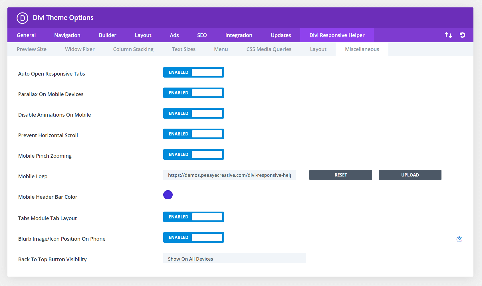
Divi has a parallax background effect feature within any section, row, column, or module. However, the built-in feature only works on Desktop! The Divi Responsive Helper plugin solves that limitation and applies it to all devices. Once you enable the feature, it automatically adds support for the parallax effect on mobile devices whenever the Use Parallax Effect setting is enabled. Please refer to our miscellaneous settings documentation to learn more about each of these features and how to use them. A demo of this feature is provided below.

In the screenshot above, you can see the option in Theme Options to enable this feature. This activates additional settings located in the Design tab of the Blurb module settings when the Image/Icon Placement is set to Left. In the next screenshot, you can see the option for choosing the Blurb Image/Icon Position on Phone to Top Left, Top Center, or Top Right.
Parallax Enabled In Section
A background image is set in the Section Background settings and the Parallax option is enabled. Normally in Divi, this only applies on Desktop, but our plugin automatically enables it on mobile devices.
Parallax Enabled In Row
A background image is set in the Row Background settings and the Parallax option is enabled. Normally in Divi, this only applies on Desktop, but our plugin automatically enables it on mobile devices.
Parallax Enabled In Column
A background image is set in the Column Background settings and the Parallax option is enabled. Normally in Divi, this only applies on Desktop, but our plugin automatically enables it on mobile devices.
Just another column here.
Parallax Enabled In Module
A background image is set in the Module Background settings and the Parallax option is enabled. Normally in Divi, this only applies on Desktop, but our plugin automatically enables it on mobile devices.
