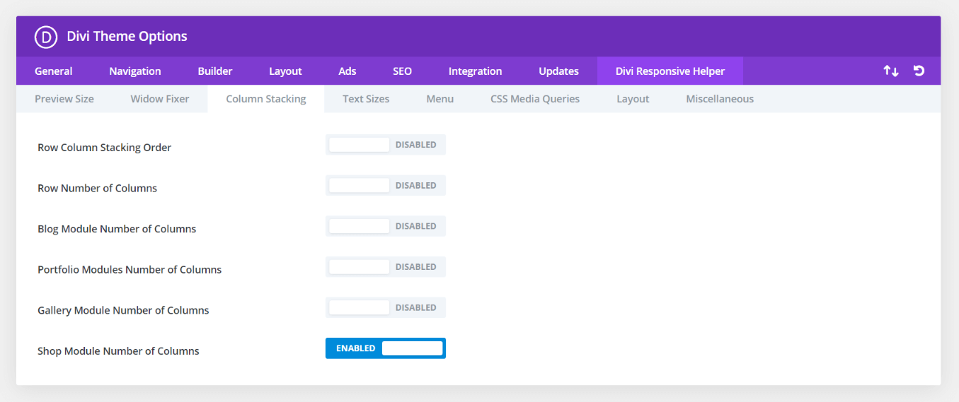
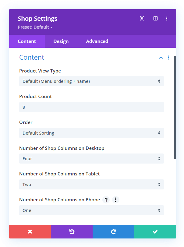
The Divi Responsive Helper plugin includes a feature to allow you to choose the number of columns you want to display side-by-side in the Divi Woo Products module (formerly named Shop) on Desktop, Tablet, and Phone devices. Please refer to our Woo Products module column stacking documentation to learn more about each of these features and how to use them. A demo of this feature is provided below.

In the screenshot above, you can see the option in Theme Options to enable this feature. This activates additional settings located in the Content tab of the Woo Products module settings. In the next screenshot, you can see the options for choosing the number of shop columns to show on each device.
In the demo below, we demonstrate all the possible scenarios, so you can see how it works on each device with any gutter size.

Row Gutter 1
4 Columns
The Number of Product Columns feature is set to 4 on Desktop, Tablet, and Phone with the Row Gutter set to 1.
3 Columns
The Number of Product Columns feature is set to 3 on Desktop, Tablet, and Phone with the Row Gutter set to 1.
2 Columns
The Number of Product Columns feature is set to 2 on Desktop, Tablet, and Phone with the Row Gutter set to 1.
1 Column
The Number of Product Columns feature is set to 1 on Desktop, Tablet, and Phone with the Row Gutter set to 1.
Row Gutter 2
4 Columns
The Number of Product Columns feature is set to 4 on Desktop, Tablet, and Phone with the Row Gutter set to 2.
3 Columns
The Number of Product Columns feature is set to 3 on Desktop, Tablet, and Phone with the Row Gutter set to 2.
2 Columns
The Number of Product Columns feature is set to 2 on Desktop, Tablet, and Phone with the Row Gutter set to 2.
1 Column
The Number of Product Columns feature is set to 1 on Desktop, Tablet, and Phone with the Row Gutter set to 2.
Row Gutter 3 (Default)
4 Columns
The Number of Product Columns feature is set to 4 on Desktop, Tablet, and Phone with the Row Gutter set to 3.
3 Columns
The Number of Product Columns feature is set to 3 on Desktop, Tablet, and Phone with the Row Gutter set to 3.
2 Columns
The Number of Product Columns feature is set to 2 on Desktop, Tablet, and Phone with the Row Gutter set to 3.
1 Column
The Number of Product Columns feature is set to 1 on Desktop, Tablet, and Phone with the Row Gutter set to 1.
Row Gutter 4
4 Columns
The Number of Product Columns feature is set to 4 on Desktop, Tablet, and Phone with the Row Gutter set to 4.
3 Columns
The Number of Product Columns feature is set to 3 on Desktop, Tablet, and Phone with the Row Gutter set to 4.
2 Columns
The Number of Product Columns feature is set to 2 on Desktop, Tablet, and Phone with the Row Gutter set to 4.
1 Column
The Number of Product Columns feature is set to 1 on Desktop, Tablet, and Phone with the Row Gutter set to 4.

