The Divi Responsive Helper plugin includes several features related to the menu and Menu module. This feature allows you choose to remove the hamburger menu icon and open the menu instead on Phone devices. There are many use cases for this, and it’s nice to have this as a simple setting. Please refer to our menu settings documentation to learn more about each of these features and how to use them.

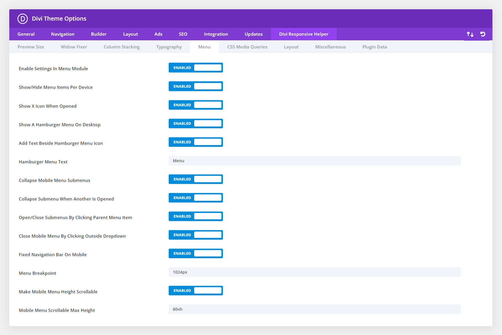
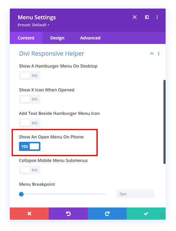
In the screenshot above, you can see the option in Theme Options to enable settings in the Divi Menu module. This activates the additional settings located in a new Divi Responsive Helper toggle in the Menu module. In the next screenshot, you can see the setting to show an open menu on mobile instead of the closed hamburger menu.
Be sure to check the demo below!

