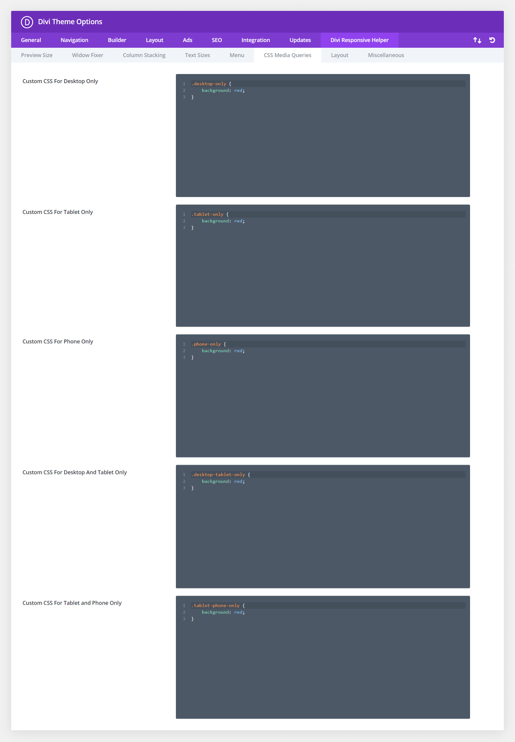
Divi comes with only one main Custom CSS input area, but if you want your CSS to only apply on certain devices sizes you would need to specifically write your own custom media queries. This can be difficult and intimidating, especially for beginners. The Divi Responsive Helper plugin provides you with several new custom CSS input boxes that correspond to all of the built in Divi breakpoint sizes. Please refer to our CSS media queries documentation to learn more about each of these features and how to use them.

CSS Affecting Only Desktop Devices (981px and up)
This is a text module with a custom class added to it called “desktop-only” and there is CSS in the Theme Options targeting anything on Desktop sizes and up.
