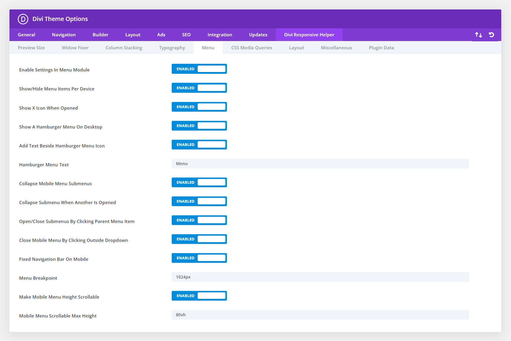
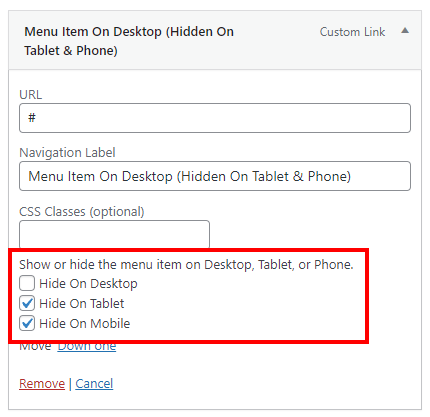
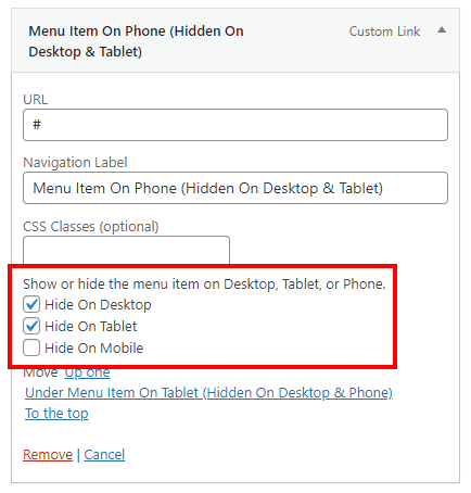
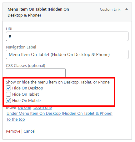
The Divi Responsive Helper plugin includes several features related to the menu and Menu module. This feature adds new checkmarks in the WordPress navigation menu items to show or hide the menu items on Desktop, Tablet, or Phone. Once enabled, each menu item in Appearance>Menus will have checkmark boxes which allow you to choose on which device sizes you want that particular menu item to be visible. Please refer to our menu settings documentation to learn more about each of these features and how to use them.


