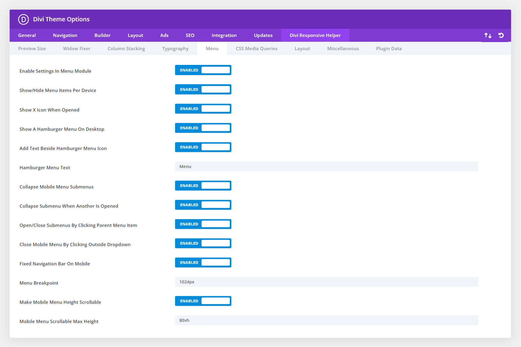
The Divi Responsive Helper plugin includes several features related to the menu and Menu module. This feature allows you to enter the screen width pixel value for the responsive breakpoint for when the menu changes between desktop and mobile versions. This is helpful especially when you have a larger number of menu items that start to overlap due to space issues. Increasing the breakpoint higher than the default 981px allows the hamburger menu to appear on larger device sizes to prevent the ugly and unprofessional stacking issue. Please refer to our menu settings documentation to learn more about each of these features and how to use them.

In the screenshot above, you can see the option in Theme Options to enable this feature. This activates additional settings located in the Content tab of the Menu module settings. In the next screenshot, you can see the option for choosing the navigation menu for Desktop, Tablet, and Phone.

