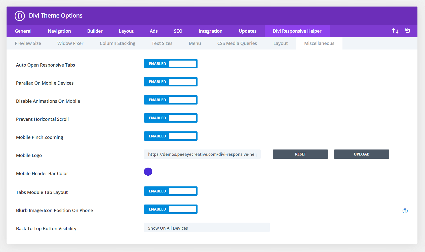
The Divi Responsive Helpers includes a setting to adjust the position of the Blurb module image/icon on Phone. This setting is very much needed when the image placement is set to left on Desktop in order to make better use of space on smaller screens. Since there is no setting like this in Divi, we decided to add it! Please refer to our miscellaneous settings documentation to learn more about each of these features and how to use them. A demo of this feature is provided below.

In the screenshot above, you can see the option in Theme Options to enable this feature. This activates additional settings located in the Design tab of the Blurb module settings when the Image/Icon Placement is set to Left. In the next screenshot, you can see the option for choosing the Blurb Image/Icon Position on Phone to Top Left, Top Center, or Top Right.
Top Left On Phone
In this example, the icon position is set to Top Left on Phone with the Divi Responsive Helper.

Top Left On Phone
In this example, the image position is set to Top Left on Phone with the Divi Responsive Helper.
Top Center On Phone
In this example, the icon position is set to Top Center on Phone with the Divi Responsive Helper.

Top Center On Phone
In this example, the image position is set to Top Center on Phone with the Divi Responsive Helper.
Top Right On Phone
In this example, the icon position is set to Top Right on Phone with the Divi Responsive Helper.

Top Right On Phone
In this example, the image position is set to Top Right on Phone with the Divi Responsive Helper.
