This page demonstrates some of the features in the Divi Carousel Maker plugin related to the responsive settings. Please be sure to review the documentation to get a better understanding of all the features that are available and how they work.
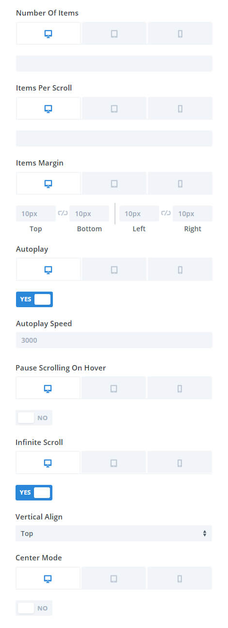
The screenshots below demonstrate that most of the settings have responsive tabs. These means that you can change the settings individually for Desktop, Tablet, and Phone devices.


